Drawing For Communication
For our introduction to the unit we looked at the earliest form or recordable communication (cave drawings) to show that communication has been necessary since as long as we know. We also looked at other kinds of informative drawings like maps and Nascar lines which are only visible in photos taken from satellites (top right photo). We were asked to think about who the artist or artists behind these drawings were trying to communicate with and why.
Our first task was to draw simple objects on the spot so we could understand that communicating
through illustration is quick and effective.
This kind of drawing can be linked with my other blog: Spare Time/Exhibitions and galleries/scribble and scratch, where artists had to draw in a specific time period. This shows that time is a huge element when it comes to illustration.
Informative Map
A informative drawing of the route we took to college including key symbols like arrows to show direction. This was to see how well we could communicate our journey just from memory. I included landmarks like churches, arches and roundabouts to make my map more clear. I think the main point of this exercise was to see how well could communicate directions through imagery without words.
12 Step Burger Guide
This is a plan for a 12 stage instruction on how to make a burger. This was another task to see if we could clearly communicate through drawing.
We worked in groups of 2 to help complete our 12 stage instruction drawing. This is my classmates drawings of the first 6 stages. The cow grazing, the cow slaughtered, the meat processed, the burger formed, the cooking of the burger and the preparation of the bun.
This the last 6 stages of our instructive drawing that I did. The stages include, adding the cheese, cutting the lettuce, tomato, adding sauce, the bun and finally eating the burger.
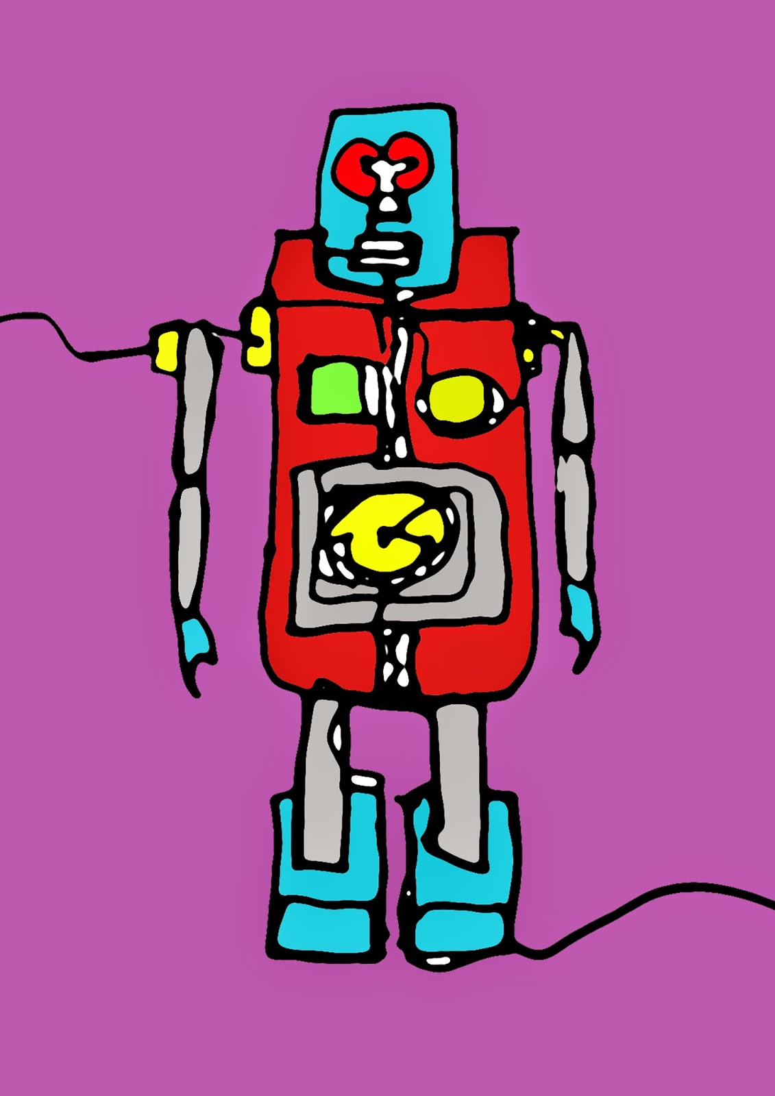
Time Limit & Different Technique Drawings
These are some of the toy robots that we were asked to draw in a variety of techniques. This exercise was to improve and expand our drawing skills. We learnt how to sketch quickly using different techniques (left handed, eyes closed). We also had different times to complete the sketch in. This helped us learn how to manage time whilst completing a sketch.
This is a single line drawing of the three robots together. I thought I picked out the key points on each robot although i messed up the scale on the second robot and it looks smaller than it actually is.
This is another line drawing that I completed in 3 minutes. This sketch has been done a lot simpler
than the last line drawing as I only had one robot to sketch. I also managed to get a bit more detail with this drawing like the arms and detail on the body.
This is a eyes closed sketch. We had 2 minutes to draw the robot from memory as we couldn't see the toy. I think that I managed to get in the key points as the drawing still looks recognisable to a robot.
.JPG)
This is a line drawing of one robot that we were asked to complete in 5 minutes. As you can see I had enough time to get in a lot of detail which really distinguishes that it is a robot. You can see a clear difference between the different line drawings I have done because of the different times we had to complete them in and the different techniques we used.
Adobe Illustrator Introduction
Here I have scanned an image of one the line drawings onto Photoshop. We have then used the filter sketch and stamp to make the illustrated lines smoother and simpler. We then filled in the blocks with different colors. I decided to use bright, vibrant colours which helps the different shapes stand out.
This is a similar process to the previous photoshop image but instead we used different textures we found on the internet. I used a red rust texture for the body, hands and feet. I used a scratched metal texture for the arms and legs. I chose a picture of a human eye for the eyes. I then filled in the detail on the body with a picture of LED lights.
Tracing photos on Illustrator
Here is a photograph of me that i took on Photo Booth using a effect called stretch. We used a blank sheet of A2 paper for the background.
Here I have brought the photo onto illustrator and using the pen tool i have traced around the image picking out the key points on my face. We used different layers to build up shapes that we could then play around with by changing the colours and sizes. This could be useful in the future when trying to distort or edit a photo
Here i have played around with some different effects. This effect has squared all the shapes off so there are no curved lines.
This effect has made all the lines jagged or fuzzy. I like this effect because of the way it distorts the image, almost like you are looking at it through frosted glass.
This effect is similar to the last although the jagged edges and lines are softer and curved. This is a very abstract version of the original which i like because key features can still be made out. Like the lips, teeth and eyes.
Object Drawing on Photoshop
We were asked to draw some sweets free hand on Photoshop as accurately as we could. We tried to avoid using lots of tools and instead just used the brush tool along with different colors and opacities.
Here is a photograph of the sweet i have drawn below. We placed the sweet on a piece of white paper so that we could really see the shape and color of the sweet.
Here is my photoshop illustration of the sweet. I started by sketching out the main shape of the sweet then adding in the details in layers. I am pleased with the outcome although some of the shape isn't quite right. I used low opacity with some of the brush strokes to form shadows and making the sweet look 3D. I used black for shadows and white for reflections of light.
Here is another sweet that i have drawn using the same techniques. this one was bait harder as the lolly pop stick is white on a white background. i had to use light treys to make out the shape. I am pleased with the outcome as i think it looks like a abstract version of the photograph above which i like. I also tried to include a shadow of the lolly in this illustration. I used a light grey with a low opacity to do this. i am pleased with the turn out of this drawing.
This exercise was useful in learning illustration on Photoshop. It also helped out Visual communication skills by representing a object using simple tools on Photoshop.
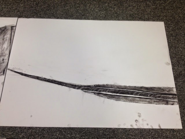
Charcoal and Chalk Drawings
Here we have started to look at using charcoal and chalk to draw some really small object. We started off by only using charcoal on white A2 sheets of paper. We had choose a point on the object to draw and fill up the entire A2 sheet. It was sometimes difficult to draw in such detail for certain objects whilst also considering shadows and tones.
Here I have drawn the tip of the blade on this tiny flick knife. I found that the blade of the knife was particularly interesting because of the texture from where it had been sharpened, this was fun to try recreate using charcoal.
Here I have drawn a birds eye view of the blade. I like that I have managed to show some tone in the handle of the blade, it makes it more clear that there are different materials making up the blade.
Here is my drawing of the handle of the blade. This is my least favourite drawing of the blade as I don't think that I got the right texture for the wooden handle although I like the tones and shadows created by the charcoal.
Here is a small model of a pan. This time we crossed over to using black paper and chalk, we had to focus on the highlights of the object in order to communicate what the drawing is. This object was interesting to draw because of all the curved lines and textures shown in the highlights.
This is the same pan drawn at a different angle. One problem that I encountered whilst drawing the pan was that the handle as it was shadowed by the rest of the pan so I had to smudged it more than the rest of the drawing.
The last process we did was using brown paper and using both chalk and charcoal to draw the objects. These were a little more time consuming than the others as we had to consider drawing both highlights and shadows. This is my favourite drawing of the workshop as I think that I managed to get the right tones for the highlights and shadows on the dinosaurs head.
Here is my last drawing of the workshop it was abit rushed as we ran out of time which meant I didn't really manage to complete it. I was happy with the outlines of the coin and queens head although I didn't focus on the shadows and highlights which are important to consider when using charcoal and chalk.
This session helped my improve my skills in charcoal and chalk drawing. It also got me thinking about shadows and tones in objects as opposed to just the shape and color.
Digital Illustration from Photography
We started to look at the artist Patrick Caulfield who was a painter who's work usually included paintings of objects or places that aren't particularly out of the ordinary. His paintings include things like windows, household objects, chairs, tables etc. His style is quite simplistic in the way he uses a lot of lines and block colours. He almost creates a different reality of the things he paints. I like the way he simplifies what he is drawing yet it is still very clear what the object or scenario is.
This painting below is called 'interior night' which shows that whatever he is painting is quite simple and not abstract or experimental in any way. This is a night time version of the 'interior noon' which is identical apart from the colder colours (blues, yellows). This work has inspired me to create some of my own illustrations although I will be using digital software and photography which makes the process a lot simpler.
Here we have started to photograph areas in and around our college. I have tried to consider shapes in the photos and tones as I will be illustrating over the top of them on illustrator. In this photo I think the squares and rectangles will be interesting to illustrate.
Here you can see the process of drawing shapes over the top of the photograph. I have used the pen tool on adobe illustrator to draw around shapes I can find in the photograph. I used a black line with a white fill so that I can clearly see the places I have drawn around.
This is my finished illustration of the stairase. I chose brighter tones of colours to give a alternate reality effect. I like the tones of dark blues and purples in blending into the brighter blue stairs. The green rails contrast with the environment.
This is a photograph of the outside of college. I thought the angle of the roof and perspective of the windows would work effectively in my illustration. I may have to simplify my illustration as the lines on the building will make it look too complex or busy.
This is my finished illustration from my photograph. I have taken inspiration from artist Patrick Caulfield by simplifying what I could see in the photograph. I just used simple block shapes and colours instead of the busy lines on the walls that you can see photograph.
This is another photograph taken outside the college of a bench. I was thinking about the perspective of the bench and wall in the background and that it would be interesting to recreate in my illustration.
This is my final illustration of the bench. I like the blue and purple tones that I have used. I think that I managed to simplify the photograph to its key points and it is still recognisable from the photo. I think my work shows a clear inspiration from the artist Patrick Caulfield although I have tried to bring in my own colour palate which could be considered as more contemporary. This exercise was very helpful in distorting or recreating a real scene or photograph.
Isometric and Geometric Illustration
We started to look into digital illustration using a isometric grid. We were asked to draw our name on a isometric grid making the letterforms look 3D. I started by printing off a isometric grid and sketched out the letter of my name. I wanted to use uppercase but I encountered a problem with the letter N in 'JONO'. I realised that the scale I was using wouldn't allow the upper case 'N' so I had to change it to lowercase.
This is a pattern that i have made using my isometric letter spelling my name (jono). I thought that it works effectively because each word fits into one and other. This is because we used an isometric grid to design the letters.
This is another pattern design i have made using the same isometric lettering. I like this one because of the abstract shapes it creates in the negative space
This is the same pattern but increased in the amount of words. This makes the effect different as the graphics are smaller making the words more illegible. This is where the isometric typography becomes a pattern.
This is another pattern design i have made using the same isometric lettering. I like this one because of the abstract shapes it creates in the negative space down the centre of the image.
On monday afternoons we have started working with an art teacher in our illustration workshops. Here we have started to make our artists books. We are experimenting with a list of words and trying to communicate it through cutting, ripping, sticking etc. The words included drip, expand, crack, dig, knot and many others. Our task was to communicate the word in a interesting way using paper, glue and scissors. I learnt a lot about communicating a message or word through physical cutting out and sticking. This is a useful skill as it is a basic method yet the outcomes were effective and communicated the words we intended. I could bring this through into my collage work as the process and techniques are similar. If i was to retry this exercise i would try some more complex words to communicate.
Here are some more designs that i made this day including, Gravity (i used two sheets of paper and little cut outs for the centre so when you move it gravity moves the shapes) splash, dig and knot.
Digital Illustration
We were asked to pick a random article off the BBC news website. We then were asked to illustrate a 10cm by 10cm image that communicates the article. I chose this article below which is about a solar powered plane to take off on a global flight. I was inspired by the title as i thought it would be interesting to use simple shapes on illustrator to communicate the article.
Here i have created the shapes that i think effectively communicate the title of the article. I traced the image of a plane from a photograph on illustrator, then the rest I just used the shape tool and chose bright colors.
Here i have added a texture by placing an image over the top and lowering its opacity. I think the effect it has on the simple shapes and colors makes the design more interesting and it almost dates it a bit which i think works effectively with the image. This was a quick exercise as we only had 10 minutes to complete. I feel like i have learnt a lot about illustrating a message and communicating it effectively with a small amount of time. I can bring this forward into a professional practice in the future when trying to design with speed yet communicating the correct message effectively.

Tracing from a Moving Image Still.
Here i have chosen a still from the film Pulp Fiction. We were asked to trace over the of our chosen image using only 4 colours. By doing this we simplified the image as a whole because certain objects didn't fit into this colour scheme. I chose Blue, White, Red and black as i thought these were the main colours that stuck out.
I got these colours from using the image trace tool then the colour select tool to make the appropriate swatches. The white turned out to be a cream or beige, the blue is from the neon light and the red is crimson.
I think this exercise was interesting and has taught me a lot about the use of colour and illustration. I like these colours together and think they work effectively. I would want to have more time on this exercise for it to be a complete illustration.


.JPG)

.JPG)

.JPG)
.JPG)
.JPG)
.JPG)