Digital Photography![]()
The introduction to Digital Photography we looked at the basic aspects of a camera and why we use them in different situations. We learnt that the ISO of a camera is the sensitivity of the sensor within the camera, so a high or fast ISO meant more sensitive and a low or slow ISO meant that the sensor was less sensitive. You want to use as low ISO as possible to avoid digital noise in a Photograph. This is where you can see a graininess in a photo called digital noise.

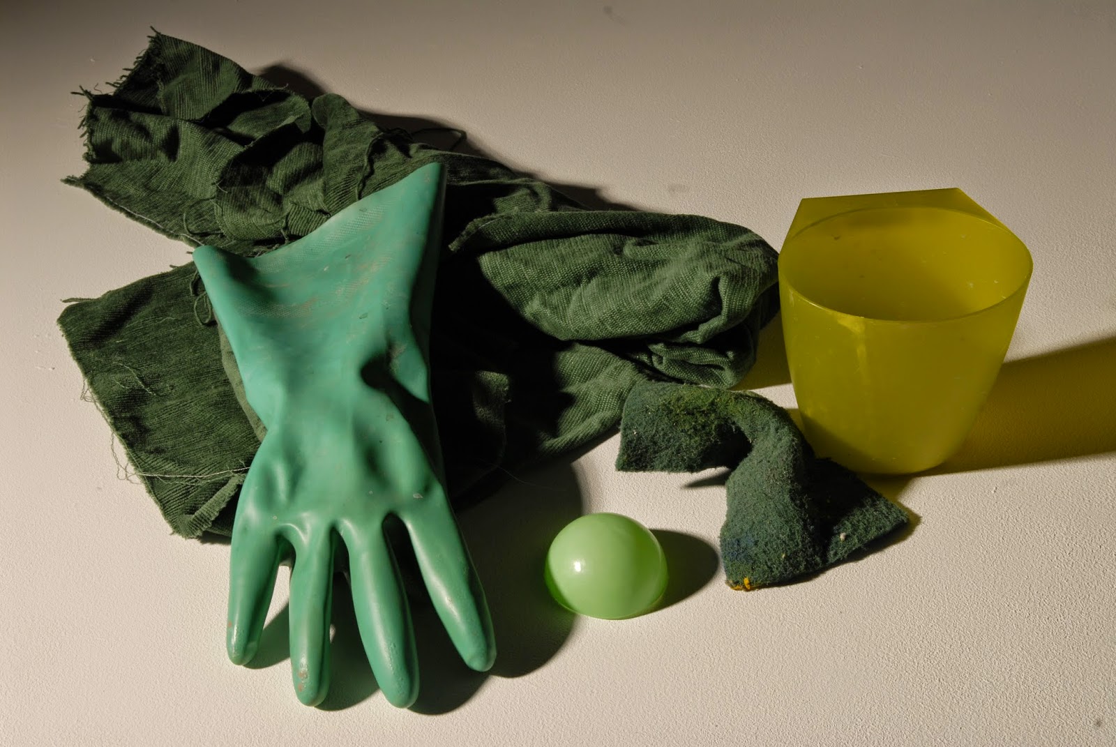
Here is a contact sheet made on Adobe Bridge. We were asked to take photos on a digital camera in and around college investigating a specific color. I was asked to investigate green and i think i managed to get a good range of different objects in the color. We created a contact sheet because it is a quick and easy way of displaying your photographs together precisely and neatly.
Still Life Photography
We started to look at still life photography. This is a still life photograph taken by Kim Preston (http://www.kp-creative.com/photography/stilllife.html). You can see that the photograph draws attention to fruit by composition and lighting. The fruit is centered in the picture and the light or flash that he has used is reflecting back at the camera. I think that still life photography is a good technique or process to present or show off whatever you are photographing as the composition of the objects is usually centered. The flash in this photograph highlights the fruit and puts emphasis on them in contrast to the dark background.
This is a still life painting which hold the same composition and lighting as the photograph above. The peppers composition is central and the light highlights the vegetables amongst the dark background. Still life photography and paintings are a good way of showing the form of objects. The lighting reveals tones and shadows of the objects which is helpful in understanding the shape and form of an object.

Here we have started to make our own still life photographs using the photos from investigating color.
Here are some objects that we were asked to collect investigating the color green. We used the photography studio in college to arrange and photograph our objects. We used lights and flashes with a SLR camera to shoot out objects. We used a painted white board to lay our objects on so there is no distraction from the objects in the background. In this image above we used one flash which is why there is shadow predominately on one side of the photo.

Here we have used a flash and another with a soft box. A soft box spreads or distributes the light from a flash so that the light isn't as harsh as without. Because we have used two lights (or flashes) the shadows of the objects are less predominant and i think the photo looks a lot more professional. This is the photo that i have decided to edit further on Photoshop.

Here i have brought my photograph onto Photoshop so i can edit it further. I have used the zoom tool firstly to check all of my image is in focus. I then used the crop tool do change the whole shape and size of the photo. This is so i can use only the desired parts of my photo. I then used adjustments and layers to experiment with different brightnesses and contrasts. I also adjusted the hue and saturation and the levels, this is so i could find the best colors and contrasts with my photo.

This is my final edited photo. I think that using Photoshop has allowed me to improve my photograph in color, contrast and brightness. I can now print this image knowing that it will look as best as possible. I decided to un crop the image before saving as i like the whole photo, including the white space around the objects. This process was helpful in showing us a understanding of still life photography. I have learnt that still life photography can be a very good way of presenting objects and showing their form and shape. This may help me in the future when photographing objects.
This is a photomontage i have made using photoshop. I used some of the photographs that i took investigating the color green.

Photoshop Editing

Here is one of my photos from the color shoot. I have used a coloured gradient on Photoshop to make the top of the image slightly blue and then fading out towards the bottom into the green. This exercise showed me that i can subtly edit an image on Photoshop without changing the photo completely.

Here is a test strip of photographic paper that we created in the dark room by exposing it to light section at a time. We used a sheet of black paper to block out the light from the rest of the test sheet. We created these test sheets so that we knew how long to expose our photos for. We exposed the sheet at 3 seconds at a time so that you know each block is another 3 seconds. I decided to go with 7 blocks down which is 21 seconds for my photo as this is the exposure i need if i want the negative black where covered.


Dark Room & Negatives
In our introduction to the dark room and exposing photographic paper we were told that the red light in the dark room is there because it is the only light spectrum that doesn't effect the paper. We were given a brief introduction into health and safety. We were told not to leave things around on the floor/bring belonging in with us unless it was for developing out photograph. This is because it is a dark room and people can easily come in and trip over. The chemicals we used are toxic if swallowed so we have to wash our hands after using them to develop photos.
Here is a test strip of photographic paper that we created in the dark room by exposing it to light section at a time. We used a sheet of black paper to block out the light from the rest of the test sheet. We created these test sheets so that we knew how long to expose our photos for. We exposed the sheet at 3 seconds at a time so that you know each block is another 3 seconds. I decided to go with 7 blocks down which is 21 seconds for my photo as this is the exposure i need if i want the negative black where covered.
Here is a image that i have decided to use for my negative. I found it in a book called 'Photographic Printing' by Gene Nocon, Page 56, Sunglasses, Jonathan Trapman. I chose this image because there is an interesting balance of tones (shadows and highlights)
Here i have started tracing over the image onto acetate. I used black acrylic paint to block out the whitest parts. I then used a black permanent marker to draw over the mid tones (grey). I used a crosshatch pattern for this as the light will shine through when developed and will look lighter than the black paint yet darker that the black in the photo that we have left clear on the acetate. I also used a pin to etch away some of the paint and pen.
This is my finished, exposed photo. I first exposed the photographic paper with the acetate on top for 21 seconds with a aperture from the light of 11. We used three different chemicals in the process of exposing this image. We dropped the image first into developer for 2 minutes, then into stop for 1 minute, then finally into fix for 4 minutes. We then dropped the image into a water bath for 30 minutes. I am really pleased with the outcome as this was my first negative that i created in a darkroom. This process could be useful to learn for future reference. I think this kind of art would be well suited for album covers/record artwork. This is a useful process to learn for Graphic Design and Photography.
Tableau Photography
We started off looking at tableau photography or staged image photography. "They are single frame movies" - Gregory Crewdson who is a famous American photographer. As our final specialist project we will be working in teams to create three tableau images using digital equipment and technology. The idea is to pick a 19th century painting and reconstruct it into a modern day Photograph using different more contemporary props to replace the ones in the painting. We have been given the option to either recreate the composition or reinterpret the subject matter within the painting and to give it a contemporary edge.
We started our research by looking in the library for artists book (between 1890s - 1910s) or Pre Raphraelite paintings around that time. I found one book by a painter called Millias. The book is called Millias and contains a lot of his work form around the era. The paintings description in the book is 'A huguenot, on St. Bartholomew's Day, refusing to shield himself from danger by wearing the roman catholic badge. This is an oil painting on canvas with a arched top. This is something that we could consider when trying to recreate the painting as a contemporary Photograph. Certain elements like the clothes will have to be modern day wear as these garments would be hard to find and would not look modern or contemporary. We could use Photoshop to recreate the arched top and oil paint effect. Which would also add a contemporary aspect to the photograph.


This is the image that we are using for the face of the mask. I will use photoshop to cut out the face and place it onto the first image like in the sketch above. For this image we used that same lighting although we re positioned it so that it was coming towards the face instead of behind it.


I have cut out the letters so that light can shine through both sheets. I like the shadow that is created in the centre of the paper and i will use this when photographing them in the studio.


After editing the levels and the hue and saturation i have found that the image reminds me of a planet in space as the light curls round the back of the letters making it look like a horizon disappearing into darkness

I have played around more with the hue and saturation finding new colours that suite my letters. I like this purple one and think the light works perfectly with the lettering

I think this one would have worked effectively with the context i am putting it into as it looks a lot like the moon or a dark planet. Although I think the purple in the one above works better as it is brighter and better suited for its context

These colours in the photo below are too vibrant and i don't think they work with the context i am putting it in.


Tableau Photography
We started off looking at tableau photography or staged image photography. "They are single frame movies" - Gregory Crewdson who is a famous American photographer. As our final specialist project we will be working in teams to create three tableau images using digital equipment and technology. The idea is to pick a 19th century painting and reconstruct it into a modern day Photograph using different more contemporary props to replace the ones in the painting. We have been given the option to either recreate the composition or reinterpret the subject matter within the painting and to give it a contemporary edge.
We started our research by looking in the library for artists book (between 1890s - 1910s) or Pre Raphraelite paintings around that time. I found one book by a painter called Millias. The book is called Millias and contains a lot of his work form around the era. The paintings description in the book is 'A huguenot, on St. Bartholomew's Day, refusing to shield himself from danger by wearing the roman catholic badge. This is an oil painting on canvas with a arched top. This is something that we could consider when trying to recreate the painting as a contemporary Photograph. Certain elements like the clothes will have to be modern day wear as these garments would be hard to find and would not look modern or contemporary. We could use Photoshop to recreate the arched top and oil paint effect. Which would also add a contemporary aspect to the photograph.
Music Industry Brief
For this project we were told to pick a song and work in groups of two to make a front cover using the Photography room and Adobe suite. We started by picking the song 'Meltdown' by Stromae, Pusha T, Q Tip, Lorde and Haim.
These are my outcomes from this project. These are the two Photographs that i have used for the project. We took a variety of images in the photography studio using very low light and a low flash on the camera. With the first image we experimented with light boxes to try and get the correct light but then decided that it was best to use just the one light coming from one angle. I think the light hits the correct areas in the photograph that we were looking for.
This is the image that we are using for the face of the mask. I will use photoshop to cut out the face and place it onto the first image like in the sketch above. For this image we used that same lighting although we re positioned it so that it was coming towards the face instead of behind it.
These are my outcomes from this project. I have used a low opacity textured image over the top of the photograph to give it a grunge look. In my different outcomes i have experimented with typography by repositioning it with the finished photo.
This is my final design that i have decided to use. I think the drop shadow on 'MELTDOWN' works well with the background image and blends into darkness well. The type below it suites the red in the background image. The colours in the type and image work effectively with each other although the mask looks a little too vibrant amongst the background. If i was to retake the photos i would spend more time making the mask have shadow so that it suite the background in the image more.
3D Type Project
We have been asked to create some 3D type for a photography exercise. We were allowed to create our letters out of what ever material we chose and have been told that we will eventually photograph them in the studio using professional cameras and lighting. I decided to use big strips of card folded once. I have started to sketch out my lettering and i have decided to use a geometric typeface made up of simple shapes (triangles and squares mostly)
I have cut out the letters so that light can shine through both sheets. I like the shadow that is created in the centre of the paper and i will use this when photographing them in the studio.
These are my completed words. I decided to pick the phrase 'Oh My Days'. I thought this is good expression and will be interesting to find a context to put it into after photographing.
We spent a whole morning in the photography studio shooting our 3D type. This is the image that i have decided to pick. We have been asked to design a A1 poster and to find a context in which suites our phrase.
After editing the levels and the hue and saturation i have found that the image reminds me of a planet in space as the light curls round the back of the letters making it look like a horizon disappearing into darkness
I have played around more with the hue and saturation finding new colours that suite my letters. I like this purple one and think the light works perfectly with the lettering
I think this one would have worked effectively with the context i am putting it into as it looks a lot like the moon or a dark planet. Although I think the purple in the one above works better as it is brighter and better suited for its context
These colours in the photo below are too vibrant and i don't think they work with the context i am putting it in.
This is my finished poster design with added type for, 'An Exhibition Inspired By Space Exploration'. I thought this was a good context as the photo communicates space themes and colours (dark purples and black). The shadow that is cast by the lighting position really emphasizes the lettering and its shapes. I have made up a date and opening time for the exhibition and put the address of the Arnolfini in Bristol city centre. We had a critical group discussion were we talked about what made our posters good or bad. Some class members think that i should have used the yellow and pink image above instead of this one but me and my tutor thought the colors worked best for this image which is why i picked it. The purples work well with the black and white of the photograph and communicate space best.
No comments:
Post a Comment